Reblogged with permission from Care Opinion UK.
Hey, it's summertime, the living is easy, the fish are jumping and we have a brand new story visualisation for you!
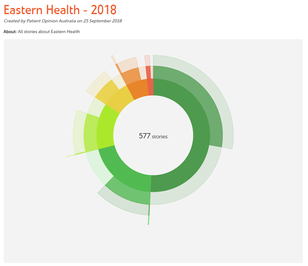
Appropriately enough, it's called a sunburst visualisation. Take a look and you'll see why:
View a live interactive sunburst
It may look good, but what does it mean? And how could you use it?
It is definitely true that, unlike our word clouds or tag bubbles perhaps, the sunburst doesn't reveal all its secrets at once. You have to explore it a little. But once you do, you'll learn a lot.
Quick overview
As always, you can create a sunburst visualisation from any search within your Care Opinion subscription.
The sunburst takes these stories and organises them into a series of circles, like this:
- The innermost circle represents all the stories. It is split up into segments according to story criticality, from 0 (not critical) to 5 (severely critical).
- The next (second) circle represents whether these stories have been read within your organisation, or not. As you move over the segments in this circle, you'll see captions appear within and below the visualisation to explain what you are looking at.
- The next (third) circle shows you whether stories have a response from your organisation.
- And finally, the fourth circle shows whether stories have led to a change (planned or made). Of course, this only applies to stories with a response, so if you haven't responded yet you'll see gaps in your sunburst.
Bonus feature
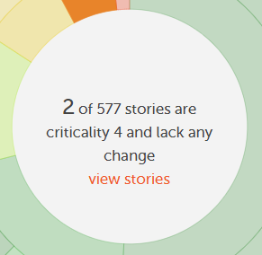
Suppose you are exploring the sunburst and you get really interested in one specific segment. "8 highly critical stories with no change in response?" you say. "I need to see them!" And of course, you can.
Select (click) the segment of interest, and it will stay highlighted. And in the centre of the sunburst, you'll see a "view stories" link appear. Just follow the link to view those stories.
How can the sunburst help you?
This visualisation is good for exploring a set of stories and asking questions like:
- How good are we at reading and responding to these stories?
- Are we showing how feedback leads to change?
- Are we logging a lot of "changes planned", but failing to update to "changes made"?
- Do our responding patterns vary according to how critical the story is?
Give it a try
I hope you'll try this visualisation out - do let me know what you think. If you have ideas for improving it, I'm listening!
And enjoy the rest of the summer.
Our new sunburst story visualisation
Our new sunburst story visualisation https://www.careopinion.org.au/resources/blog-resources/3-images/1b95658d750943f8b9cab414fef098a5.png Care Opinion Australia +617 3354 4525 https://www.careopinion.org.au /content/au/logos/co-header-logo-2020-default.pngUpdate from Care Opinion Australia tech
Posted by Craig Hislop, Care Opinion Australia, on
Thanks for your feedback.


