On Care Opinion, you can create a variety of visualisations which allow you to present information on stories you have searched for in visually appealing ways. Like many things on Care Opinion, this starts with a search for stories that you would like to be represented in the visualisations you choose. You can find out more about searching for stories by reading our Stories search options and Basic searching.
Once you have created your search, on the 'search' bar on the left of your screen, you will see the option to create a visualisation.
Once you have clicked on this, you will see the variety of visualisation options that you have available to you. These include:
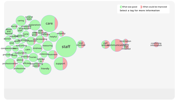
Tag bubbles: This shows the most popular tags for your stories as bubbles. The bubbles are split according to how often the tag is used to say "what was good", or "what could be improved".
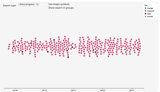
Story Swarm: This shows how your stories are spread over time and allows you to see patterns in story progress or criticality. Up to 400 stories are included.
Lily Pad: This shows how your stories are spread according to the services they relate to. Each circle represents an organisation or the service it provides. The more stories about a service, the larger the circle for that service. Some stories are about multiple services, so you may see services outside your own subscription scope on the lily pad.
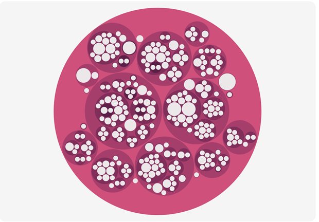
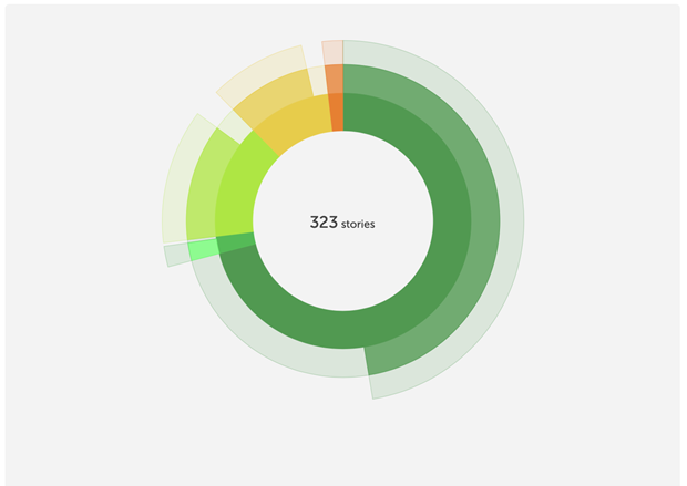
Sunburst: This shows how stories progress from being told to being read, responding to and perhaps leading to change too. Stories are grouped by criticality. Each ring represents a step on the journey from told to read, responded and leading to change.
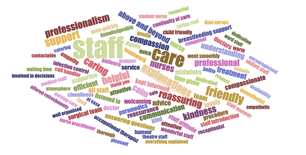
Tag word cloud: This shows the most popular tags for your stories as words, sized according to use. You can choose the tags people used to say "what was good", "what could be improved" or "how did you feel?"
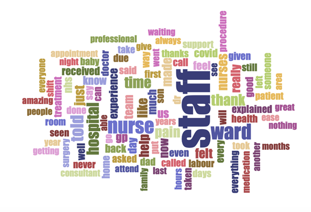
Story word cloud: This shows the most commonly used words in the text of your stories, based on the last 100 stories.
Sharing visualisations and visualisation features:
You can share visualisations with anyone, whether they are on your subscription or not. To do this, you need to save the visualisation, name it and provide a short description. Once you have saved it, you will be provided with a link that you can use to share with anyone.
Many of our visualisation are also interactive, meaning that the people you share them with will be able to click into the visualisations themselves to learn more about the information and stories that are being represented.
Following is also a short video that will take you through the process of creating a visualisation and how to run reports:
